Show the code
# Load packages
library(tidyverse)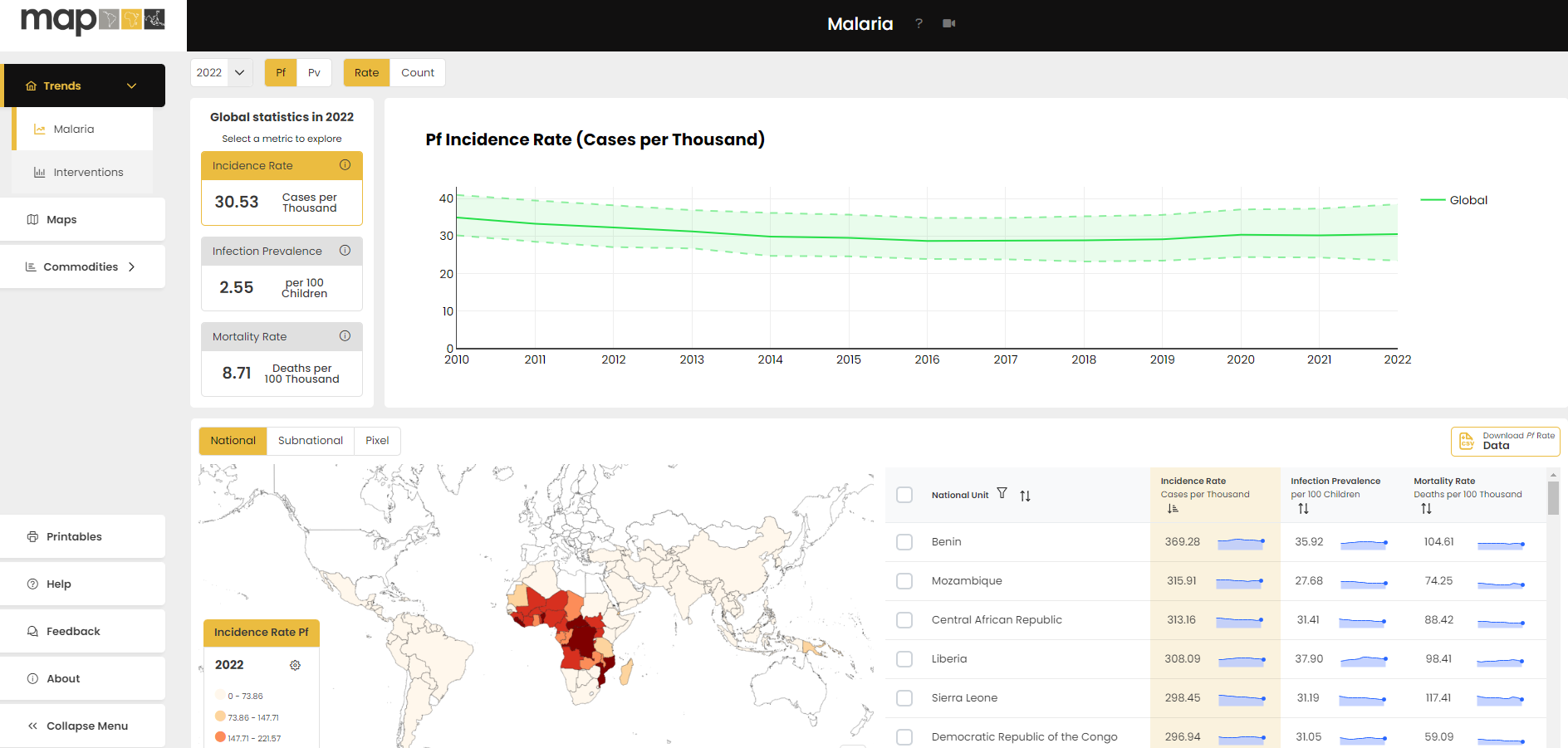
source(here::here("theme_health_radar.R"))The Malaria Atlas Project (MAP) is a leading global resource that compiles and analyses spatial data on malaria transmission and prevalence. The MAP site houses millions of data elements and provides innovative analytical approaches to making sense of complex malaria data.
The analytical approaches available on the site use geospatial analysis, spatiotemporal statistical methods, machine learning, and computational disease models.
Collaboratively, MAP produces these outputs with a core team based at the Telethon Kids Institute and Curtin University in Perth, Western Australia; and Ifakara Health Institute in Dar es Salaam in Tanzania. MAP also has members across Europe, the United States, Africa and Asia.
MAP data can be accessed directly from https://data.malariaatlas.org/ in various formats, including by:
Generating maps and charts on the site, and selecting parameters of interest. The site also allows various variables to be overlaid spatially.
Downloading CSV and Raster file formats for analysis using other software outside the site. The download process allows users to filter for national and subnational areas of interest.
Description
MAP estimated data on malaria covers morbidity, mortality, interventions, and contributing factors, primarily covering the years from 2000 to 2022 (as of 2024). Specifically;
The data listed above can be found at https://data.malariaatlas.org/
Most information provided by MAP comprises modelled estimates rather than definitive data, which may carry inherent uncertainties. Consequently, it is essential to acknowledge the uncertainties associated with the data when drawing conclusions.
MAP data are aggregated annually, which may lead to several pitfalls such as;
Seasonal variations: Annual data may not capture the seasonal patterns of malaria transmission, which can be influenced by factors such as rainfall, temperature, and vector abundance. This can lead to an over- or underestimation of the disease burden and the impact of interventions.
Temporal aggregation: Aggregating data annually may mask important short-term dynamics, such as outbreaks or the immediate impact of interventions.
The tabs below have videos that will help you navigate through the MAP data. These guides are also found on MAP’s |> help page.
Trends Help Guides
Map Help Guide
Case Management Help Guide
Insecticide Treated Nets Help Guide
The data used in the creation of this first plot can be accessed as follows:
Navigate to the MAP Data page
Select the dropdown menu labelled ‘Trends’ visible on the top left-hand side of the page. From this dropdown menu, select the ‘Interventions’ option.
A world map should be visible at the bottom of your screen. Just above this map are the options ‘National’, ‘Subnational’ and ‘Pixel’. Select ‘Subnational’.
To the far right of the ‘Subnational’ button, click on the button labelled ‘Download ITN Rate Data’.
A popup should appear on your screen. Leave all metrics selected, but select just the year 2022 and the regions of Malawi. 6. Click ‘Download selected’.
# Load packages
library(tidyverse)
source(here::here("theme_health_radar.R"))# Load the selected data
data <- read.csv("Subnational_Unit-data.csv")
# Plot ITN metrics at a subnational level in Malawi
ggplot(data, aes(x = as.factor(Name), y = Value, fill = Metric)) +
# Create bar plot with identity statistic and no legend
geom_col(position = "dodge") +
# Use the health radar color scheme
scale_fill_manual_health_radar() +
# Set y-axis ticks increment to 10
scale_y_continuous(breaks = seq(0, max(data$Value, na.rm = TRUE), by = 10)) +
# Add titles and labels
labs(
title = "Estimated subnational ITN use, access, and use rate in Malawi (2022)",
x = "Region",
y = "ITN Use* (per 100 people)",
caption = str_wrap("Estimated subnational ITN use, access, and use rate (ITN use given access) per 100 people in Malawi in the year 2022. We can see that only a slightly higher proportion of the population has access to ITNs than uses them in every region of Malawi, which is reflected in the relatively high use rates, all of which are above 80%. Source: MAP 2024. *Or access or use rate", width = 100)) +
# Apply the health radar theme
theme_health_radar() 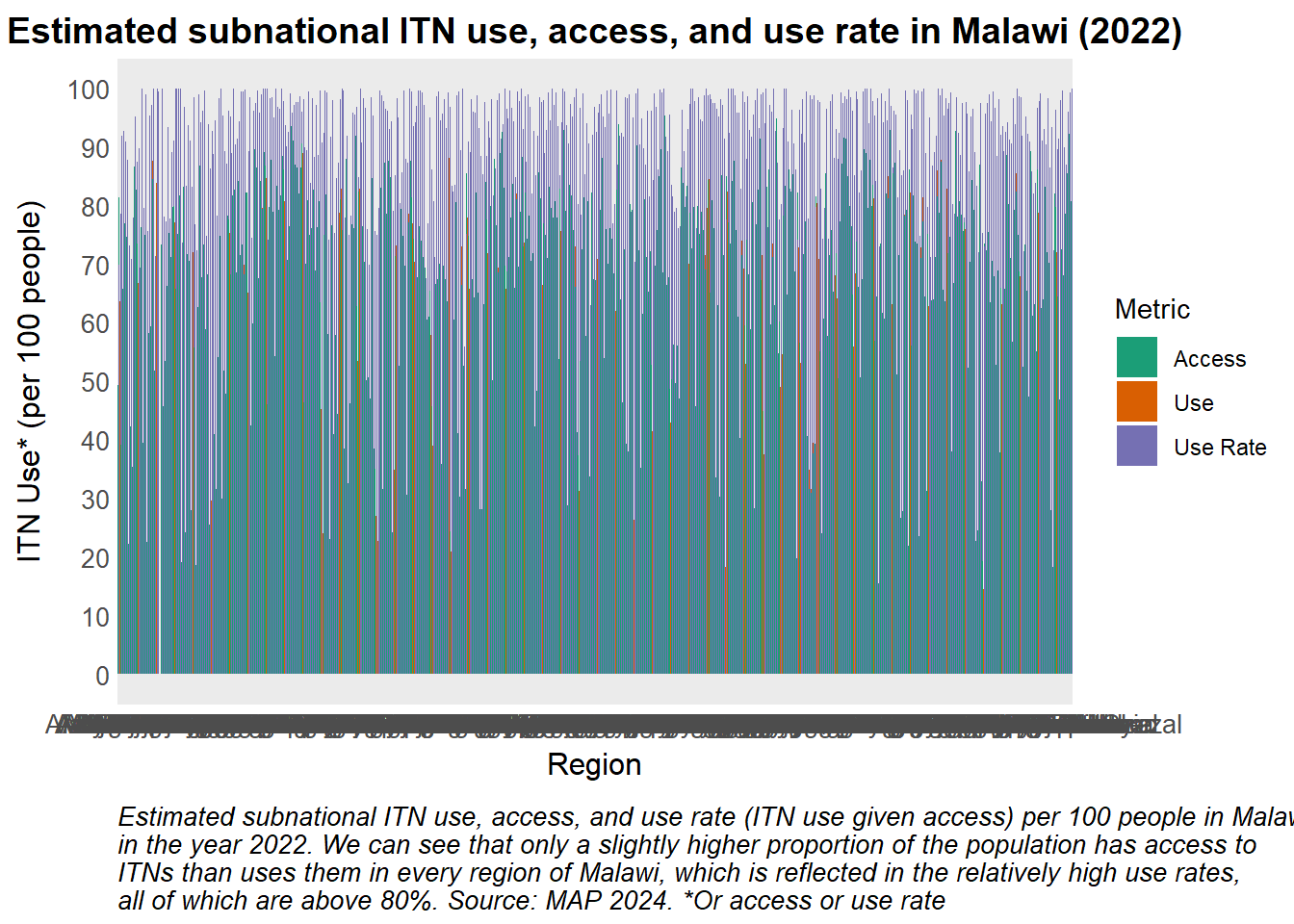
To download raster files from the MAP website,
Click on “Maps”
Select the drop down arrow titled “Layer Catalogue”
Select the data theme of interest, such as “Accessibility”
Click the “Download” symbol beside the description of the dataset in which you are interested.
As the resulting dataset for global walking only travel time to healthcare is very large, the code which follows uses a version of this data which has been filtered to include data for Zambia only.
library(tidyverse)
library(sf)
library(terra)
library(patchwork)

# Specific link used to access Shapefile: (https://data.grid3.org/datasets/d27357c640394f11943316e36cebaba3_0/about)

# Load the data and filter by provinces of interest
shp_zambia <- sf::st_read(
            "Zambia_-_Administrative_District_Boundaries_2022/Zambia_-_Administrative_District_Boundaries_2022.shp",
  quiet = TRUE) |>
  filter(PROVINCE %in% c("Eastern", "Northern", "Southern", "Western"))


# Load raster file containing walking only travel time to healthcare
raster_walk <- rast("Global_Walking_Only_Travel_Time_To_Healthcare_ZMB.tiff")

# Extract mean walking time to health facility in each district
df_walk <- terra::extract(raster_walk, shp_zambia, mean, na.rm = T, ID = T) |>
  as.data.frame() |>
  tibble::rownames_to_column() |>
  mutate(OBJECTID = as.numeric(rowname)) |>  #OBJECTID is the unique ID in the shapefile
  left_join(shp_zambia, by = c("OBJECTID"))
The mean walking time to access healthcare by Zambian district can be visualised using a bar plot. The province in which each district is located can be distinguished by colour.
# Filter the data to include only rows where PROVINCE is not NA
df_walk <- df_walk |>
  filter(is.na(PROVINCE) == FALSE) |>  # Remove rows with missing PROVINCE values
  arrange(PROVINCE, DISTRICT)  # Arrange the data by PROVINCE first, and then DISTRICT in ascending order

  # Create a ggplot object with the filtered and sorted data
  # Adjust the order of the factor variable DISTRICT's levels so that districts in the same province appear together
  df_walk |> ggplot(aes(x = factor(DISTRICT, levels = df_walk$DISTRICT),
                        y = `Global_Walking_Only_Travel_Time_To_Healthcare_ZMB`,
                        fill = PROVINCE)) +
  # Add bar plots to the chart, with bars filled by PROVINCE
  geom_bar(stat='identity') +
  # Apply custom theme
  theme_health_radar() +
  # Customize the x-axis text to be angled and adjusted
  theme(axis.text.x = element_text(angle = 70, hjust = 0.6)) +
  # Apply custom fill color scale
  scale_fill_manual_health_radar() +
  # Add labels and title to the plot
  labs(
    title = "Mean walking time to access healthcare in Zambia, by district",
    x = "District",
    y = "Mean Walking Time (min)",
    fill = "Province",
    caption = str_wrap(
      "The average walking time in minutes of various districts in selected provinces from their closest healthcare provider. The Northern province has districts with some of the highest walking times to access healthcare, while the Eastern Province district of Chadiza has the lowest. This lowest average walking time to a healthcare facility is still over an hour. Source: MAP",
      width = 100))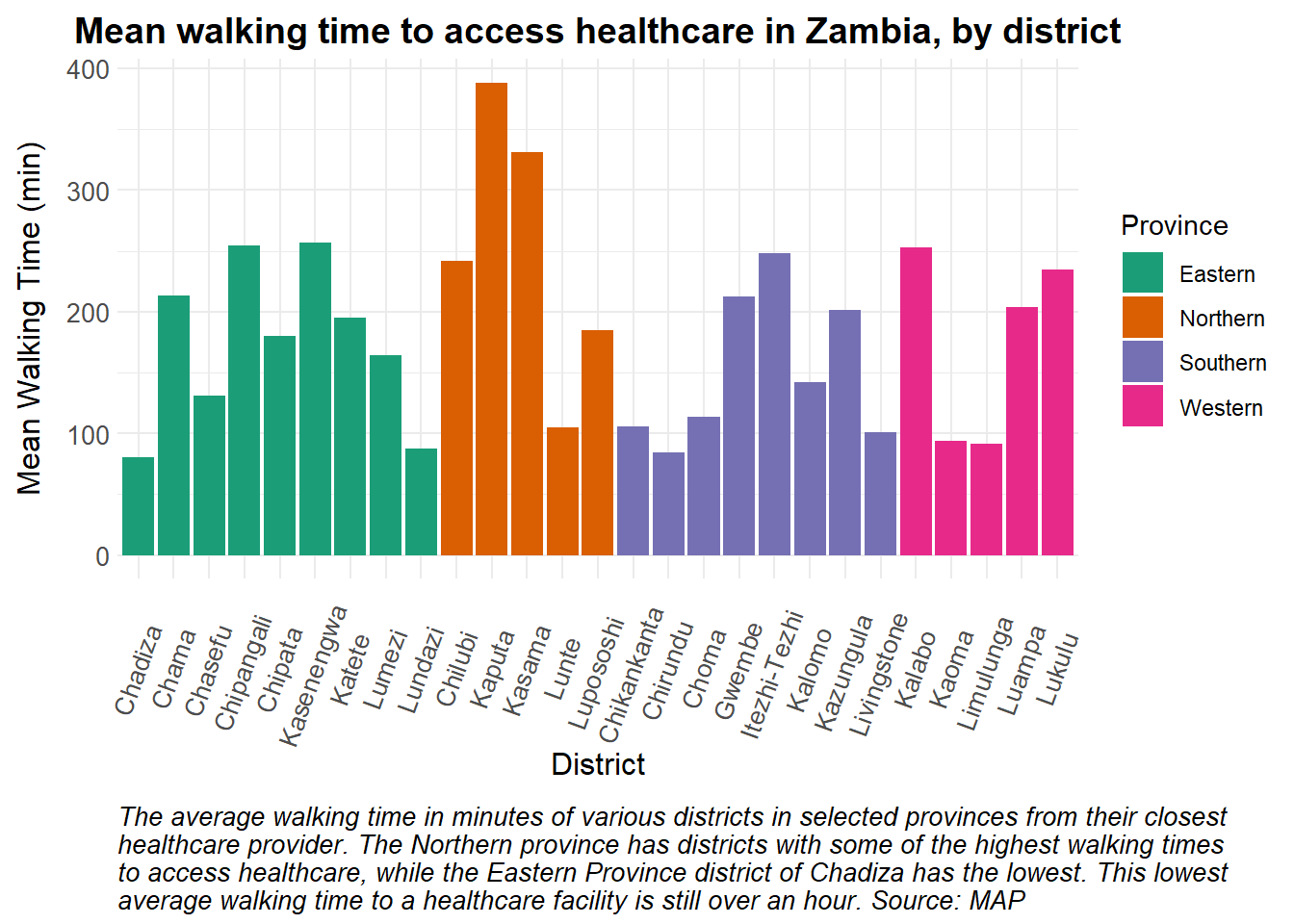
The Malaria Atlas Project provides modelled estimates for various interventions, including indoor residual spraying (IRS). Below, we show how IRS coverage estimates from MAP can be used for disease modeling.
The code below demonstrates how IRS coverage data can be prepared for modeling, using data from Zambia as an illustrative example. In the code, we show that the coverage data are presented on a annual basis, as depicted in the plot.
# Read in IRS data.

IRSdata <- read.csv("National Unit-data.csv") |>
  mutate(sprayed = (Value/100)*3600000, # estimated number of households sprayed in Zambia
         time = c(seq(0, 365*9, by = 365))) # time steps for each year for 10 years


# Coverage plot

ggplot(data = IRSdata) +
  geom_col(aes(x = Year, y = Value, fill = theme_health_radar_colours[9])) +
  expand_limits(y = 0) + # ensure y-axis starts at 0
  labs(
    x = "Year",
    y = "IRS Coverage (%)",
    title = "Countrywide IRS coverage for Zambia",
    caption = str_wrap("This plot illustrates yearly country-wide IRS coverage from 2013 to 2022. The graph reveals fluctuations in coverage over the years, with a notable low in 2013 and 2018. Source: MAP")
  ) +
  scale_x_continuous(breaks = round(seq(min(IRSdata$Year), max(IRSdata$Year), by = 1))) + # Rounding x-axis values
  theme_health_radar() +
  theme(legend.position="none")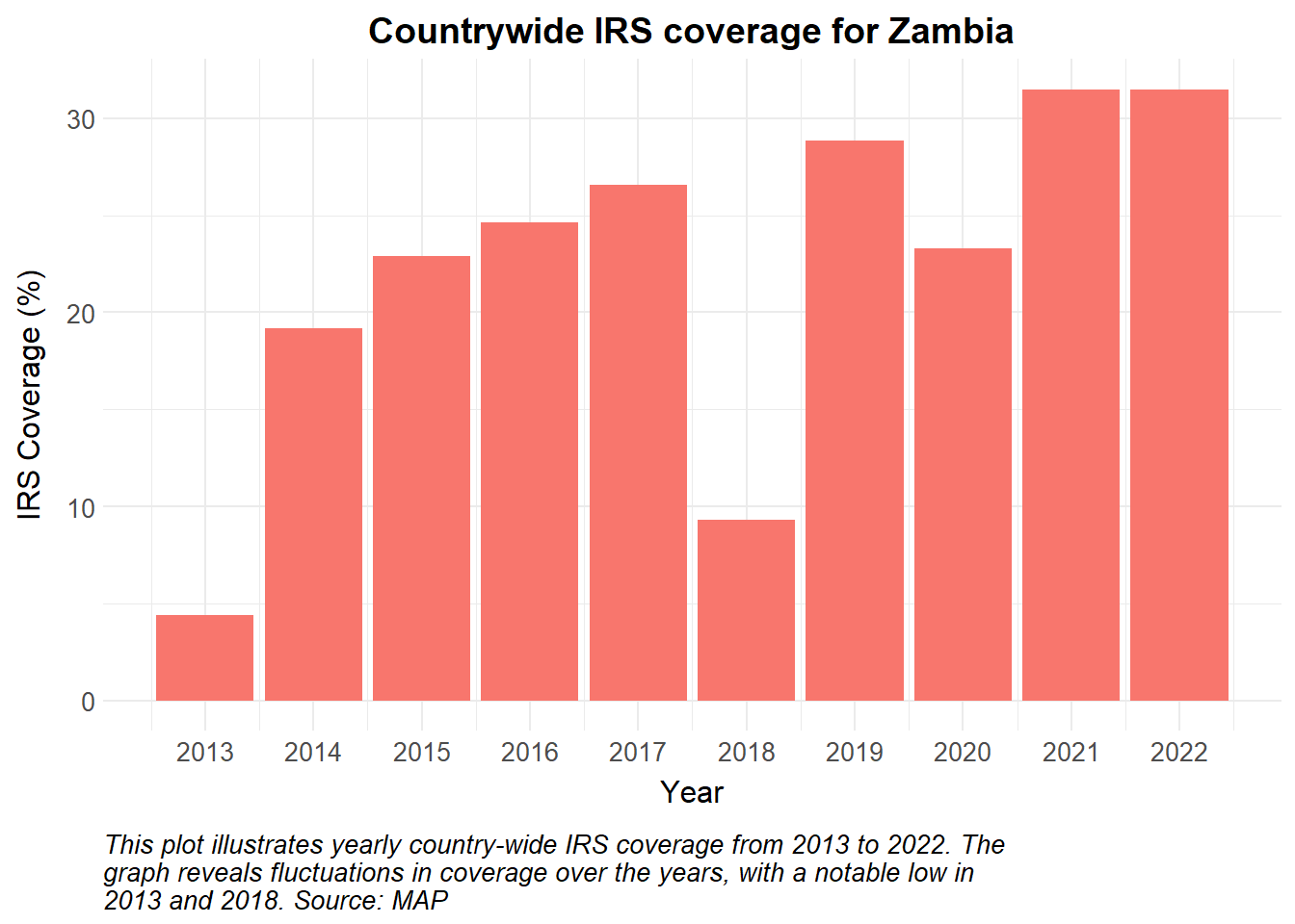
To incorporate this into a mathematical model, we obtain the absolute number of households sprayed from MAP and calculate the actual number of individuals protected. Using a constant human population of about 17,000,000, we assume a number with 5 individuals per household and a total of 3400000 households.
It is crucial to articulate the assumptions underlying the dynamics. In addition to the above, we assume the vector population is at equilibrium, the force of infection is seasonal, and all areas are eligible for IRS.
The parameters used to inform the model are described below. These should be replaced with country-specific data on seasonality, IRS implementation and other health system dynamics.
A more complex model may have further incorporated intervention uptake/refusals, as are known to occur with IRS, as well as the biting and resting behaviours of the dominant vector in the country.
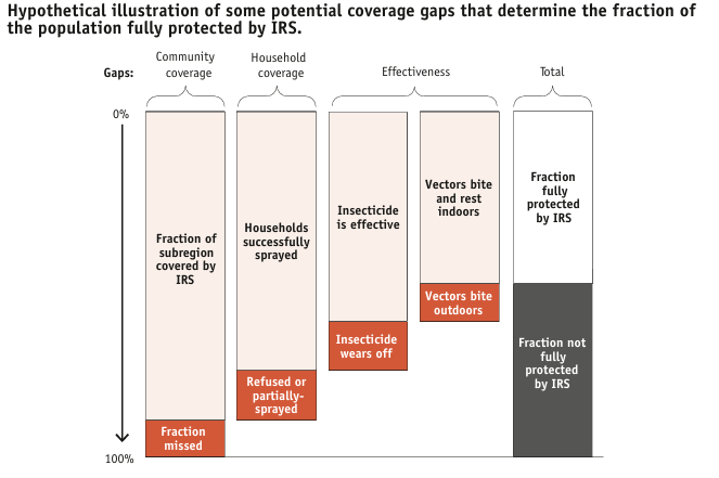
In this example, we plot daily incidence from 2013 to 2022. As Indoor Residual Spraying (IRS) is intended to repel and kill mosquitoes, we anticipate a reduced human biting rate and therefore lower transmission rates. Plotting incidence for this model may highlight the estimated impact of IRS on cases over time.
#| echo: true
#| code-fold: true
#| code-summary: "Show the code"
#| warning: false

library(deSolve)

# Time points for the simulation
Y = 10 # Years of simulation
times <- seq(0, 364*Y, 1) # time in days

# Make a time dependent function of annual IRS coverage
irs_cov <- approxfun(IRSdata$time, IRSdata$sprayed, t, method = "constant", rule = 2)

# Define basic dynamic Human-static Vector model ####
seirs <- function(times, start, parameters, irs_cov)  {
  with(as.list(c(parameters, start)), {
    P = S + E + A + C + R + G
    M = Sm + Em + Im
    m = M / P

    # Time dependent IRS coverage
    IRSc = (irs_cov(times))*pp_h/365/P # daily proportion of the population covered by current spraying cycle
    IRSe = min(1, IRS)*irs_eff # effective IRS coverage, proportion of population covered by IRS should never be more than 1

    # Seasonality
    seas.t <- amp * (1 + cos(2 * pi * (times / 365 - phi)))

    # Force of infection
    Infectious <- C + zeta_a*A #infectious reservoir
    lambda = ((a^2*b*c*m*Infectious/P)/(a*c*Infectious/P+mu_m)*(gamma_m/(gamma_m+mu_m)))*(1-IRSe)*seas.t

    # Differential equations/rate of change
    dSm = 0
    dEm = 0
    dIm = 0

    dS = mu_h*P - lambda*S + rho*R - mu_h*S
    dE = lambda*S - (gamma_h + mu_h)*E
    dA = pa*gamma_h*E + pa*gamma_h*G - (delta + mu_h)*A
    dC = (1-pa)*gamma_h*E + (1-pa)*gamma_h*G - (r + mu_h)*C
    dR = delta*A + r*C - (lambda + rho + mu_h)*R
    dG = lambda*R - (gamma_h + mu_h)*G

    dCInc = lambda*(S+R)
    dIRS = IRSc - decay*IRS

    output <- c(dSm, dEm, dIm, dS, dE, dA, dC, dR, dG, dCInc, dIRS)
    list(output)
  })
}
# Input definitions ####
#Initial values
start <- c(Sm = 30000000, # susceptible mosquitoes
           Em = 20000000, # exposed and infected mosquitoes
           Im = 800000, # infectious mosquitoes
           S = 9000000, # susceptible humans
           E = 1500000, # exposed and infected humans
           A = 1000000, # asymptomatic and infectious humans
           C = 2000000, # clinical and symptomatic humans
           R = 1500000, # recovered and semi-immune humans
           G = 2000000, # secondary-exposed and infected humans
           CInc = 0, # cumulative incidence
           IRS = 0.5 #proportion of the population currently protected by IRS
           )


# Parameters
parameters <- c(a = 0.28, # human feeding rate per mosquito
           b = 0.3, # transmission efficiency M->H
           c = 0.3, # transmission efficiency H->M
           gamma_m = 1/10, # rate of onset of infectiousness in mosquitoes
           mu_m = 1/12, # natural birth/death rate in mosquitoes
           mu_h = 1/(60*365), # natural birth/death rate in humans
           gamma_h = 1/10, # rate of onset of infectiousness in humans
           r = 1/7, # rate of loss of infectiousness after treatment
           rho = 1/365, # rate of loss of immunity after recovery
           delta = 1/150, # natural recovery rate
           zeta_a = 0.4, # relative infectiousness of asymptomatic infections
           pa = 0.1, # probability of asymptomatic infection
           pp_h = 5, # number people per household in Zambia
           irs_eff = 0.8, # IRS effectiveness at reducing transmission
           decay = 1/(4*30), # rate at which IRS wanes in days
           amp = 0.6, # Amplitude
           phi = 200 # phase angle; start of season
)

# Run the model
out <- ode(y = start,
           times = times,
           func = seirs,
           parms = parameters,
           irs_cov = irs_cov)

mo <- as_tibble(as.data.frame(out)) |>
  mutate(
    P = S + E + A + C + R + G,
    Inc = c(0, diff(CInc))) |>
  pivot_longer(names_to = "variable", cols = !1) |>
  mutate(date = ymd("2013-07-01") + time)

mo |>
    filter(variable == "Inc", date > ymd("2014-01-01")) |>
    ggplot(aes(x = date, y = value)) +
    geom_line(color = theme_health_radar_colours[19]) +
    scale_y_continuous(labels = scales::unit_format(unit = "K", scale = 1e-3)) +
    labs(
      x = "Year",
      y = "Incidence",
      title = "Daily country-wide incidence in Zambia",
      caption = str_wrap("This example plot illustrates the daily country-wide incidence of malaria from 2014 to 2022. The graph reveals fluctuations in incidence over the years, with a slight increase in 2019 coinciding with low IRS coverage in 2018. This highlights the potential impact of reduced intervention efforts on malaria transmission. Source: Model output.")) +
    theme_health_radar()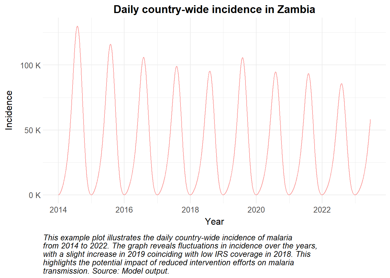
Policymakers may need to justify the use or scale-up of IRS as part of their integrated vector management strategy. Modelling this intervention allows users to assess the impact of IRS on the force of infection, thereby quantifying its effects. In addition, simulating implementation details such as the residual efficacy of the specific insecticide applied, the frequency of application (annual or bi-annual), or the timing of the campaign are key insights for malaria programming.